Adding Asserts During and After Test Recording
An assert is a boolean expression used to help debug and test a condition as part of the code execution. If the condition is met (true), the program continues to run as normal. However, if the condition is not met (false), an assertion failure is triggered, and the test will halt or an error message will be displayed. Using assert primarily aims to catch bugs or unexpected conditions during the development phase.
With Sofy, when you use an assert and the condition is not met during testing, you can either stop your test execution or create a warning but continue to execute your test. This selection is made when you are specifying the assert rules.
Adding Asserts while Recording a Test Case
- Log in to your Sofy account.
- Click Device Lab from the left navigation bar.
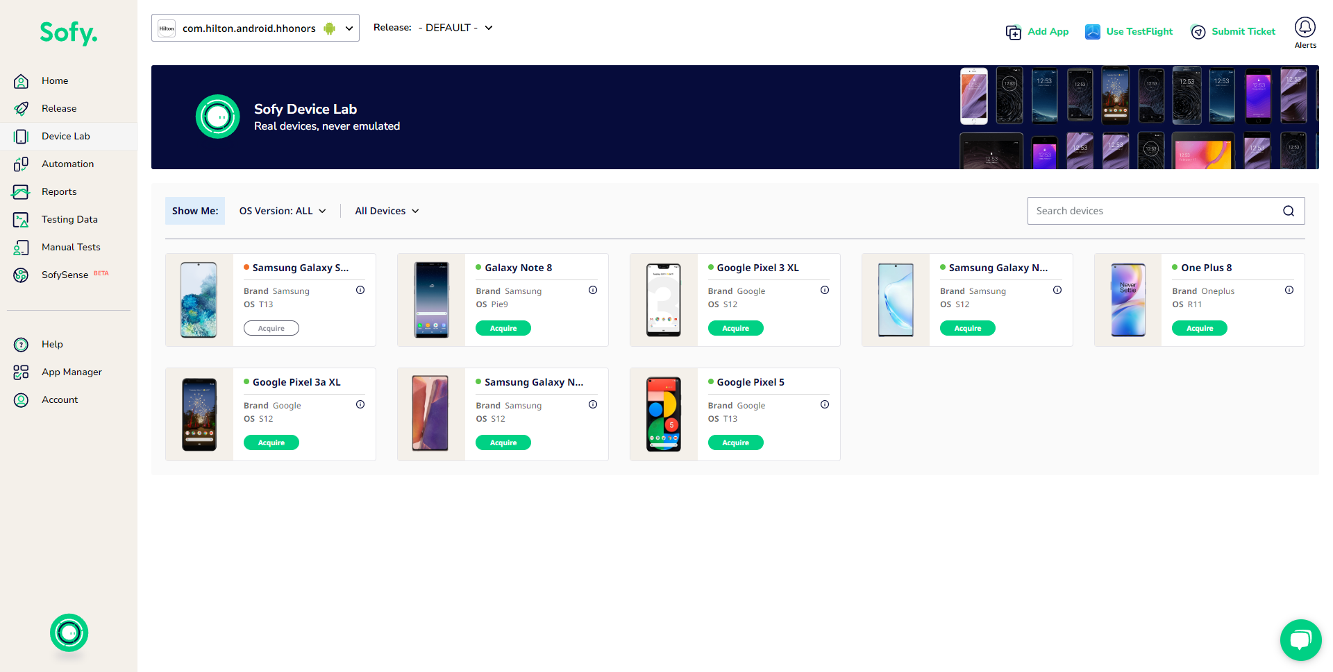
- Acquire and launch a device.
- Start recording a test case.
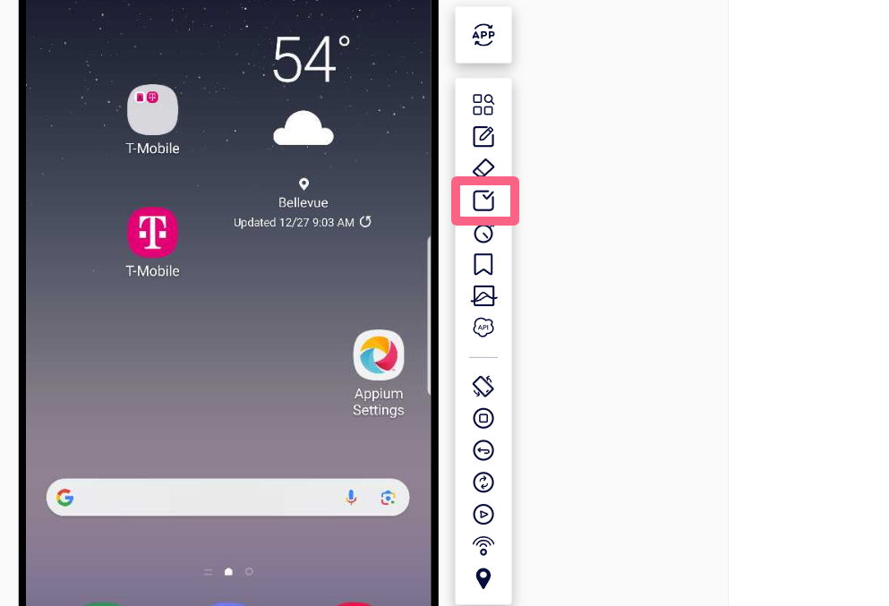
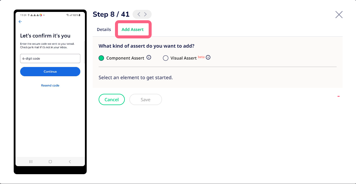
- To add an assert, click the Assert icon in the action bar to the right of the device.
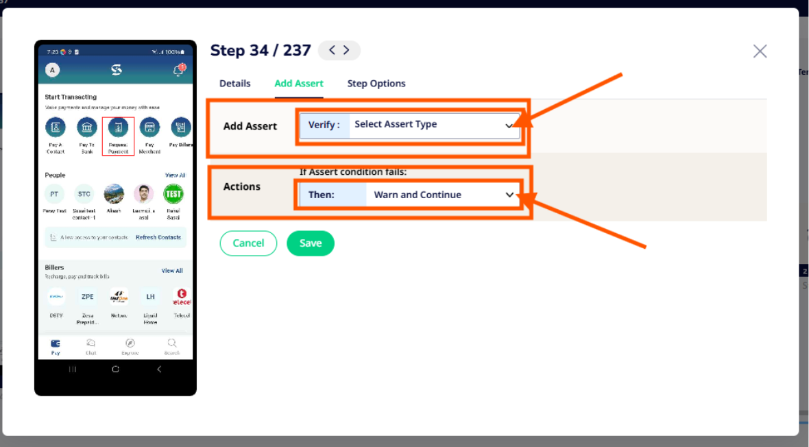
- Click on a component or element on your app. This will open the Add Assert window.
- Configure the following assert settings:
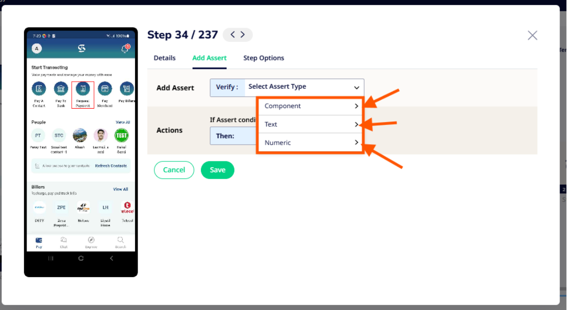
- Verify: Choose from the following asserts:
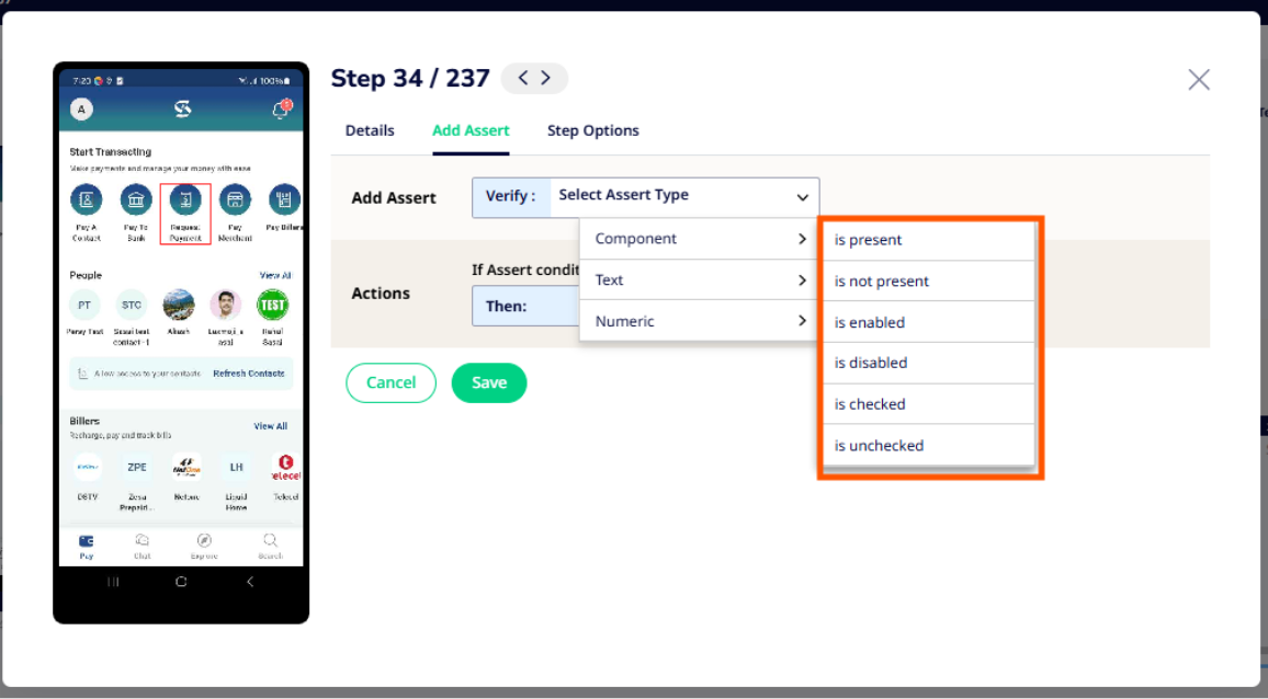
- Component: Check if a certain component is present or absent, enabled or disabled, checked or unchecked, and so on.
- Text: Verify that certain text is present, or if a field contains text.
- Numeric: Verify whether a numeric condition or expression evaluates as expected.
- Then: Specify what you want the system to do if the assert fails. Choose from the following:
- Fail Test: If the visual match is not made on the specified step, the test will automatically end with a “Failed” status.
- Warn and Continue: If the visual match is not made on the specified step, a warning will be added to the step but the test will continue.
- Verify: Choose from the following asserts:
Adding an Assert to an Existing Text Case
You can add either a Component Assert or Visual Assert to an existing test case. A Component Assert can be used for validating text, content, numeric values, component existence, or element properties. A Visual Assert can be used when selecting a region of this screen to validate images or elements that are not well-defined, or to ensure that your visuals are consistent.
Note: We do not recommend using a Visual Assert for the following scenarios:
- For automated tests recorded and run on devices that have largely different screen sizes. For example, the test was recorded on a mobile device and played on a tablet.
- The custom bounds are drawn around an area that might contain noise. For example, if your app has a white background and the element you’ve selected has a lot of white space, the system might mark those white spaces as redundant, resulting in a false positive or incorrect match.
To add an assert to an existing test case:
- Log in to your Sofy account.
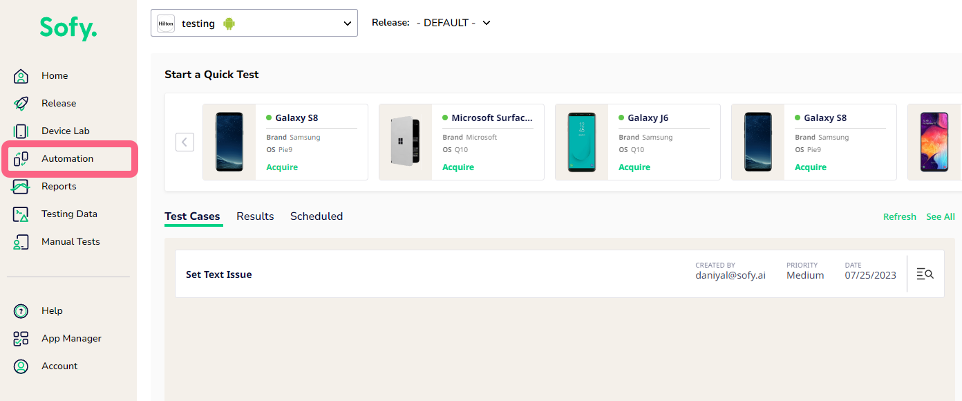
- Go to Automation from the left navigation bar.
- Select a test case.
- Find and select the step you want to add a Visual Match override to, then select Edit from the popup.
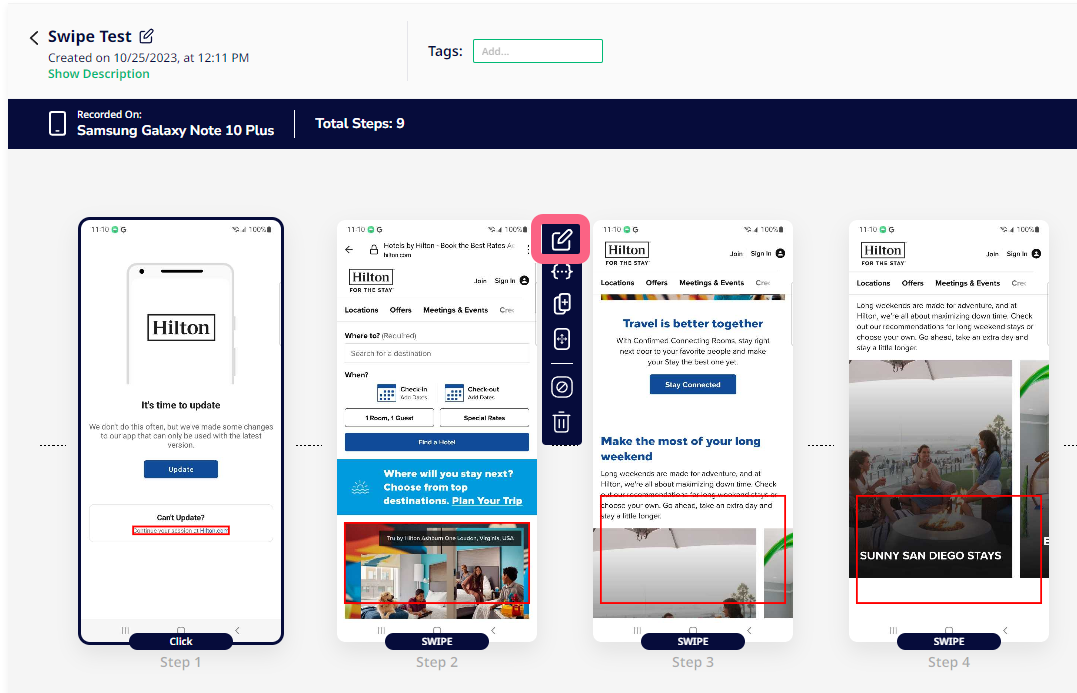
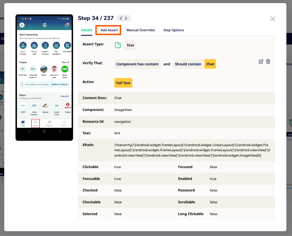
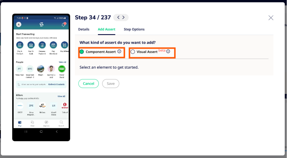
- Select the Add Assert tab.
- Choose what kind of assert you want to add:
- Component Assert: Used for validating text, content, numeric values, component existence, or element properties.
- Click on an element or component on the screen to the left.
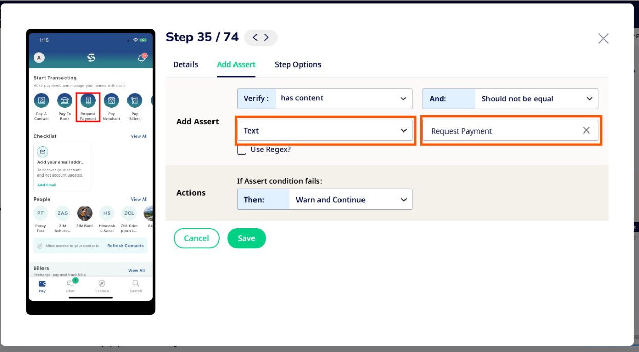
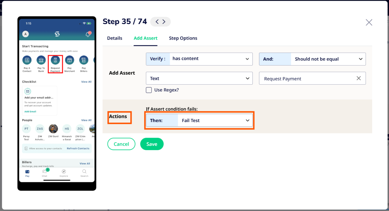
- Configure the following assert settings:
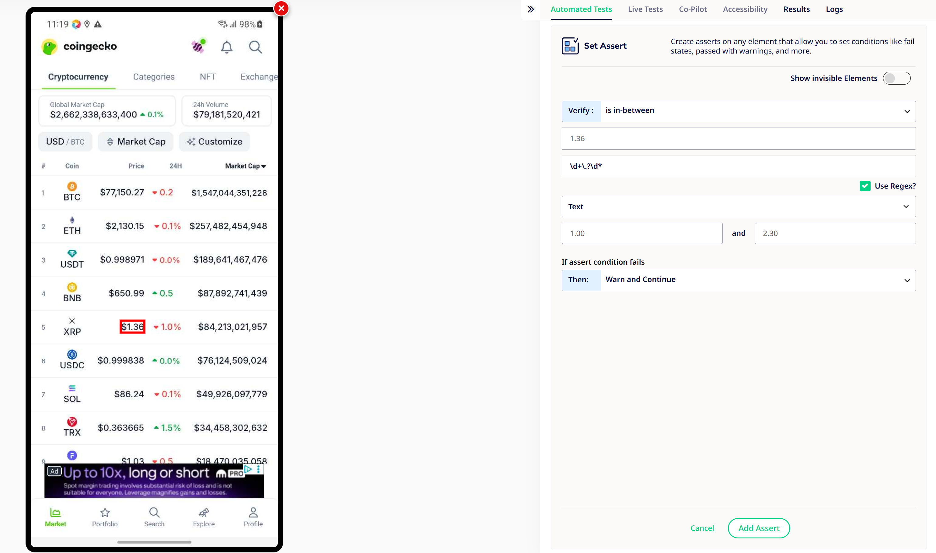
- Verify:
- Component: Check if a certain component is present or absent, enabled or disabled, checked or unchecked, and so on.
- Text: Verify that certain text is present, or if a field contains text.
- Numeric: Verify whether a numeric condition or expression evaluates as expected.
- Then: Specify what you want the system to do if the assert fails. Choose from the following:
- Fail Test: If the visual match is not made on the specified step, the test will automatically end with a “Failed” status.
- Warn and Continue: If the visual match is not made on the specified step, a warning will be added to the step but the test will continue.
- Verify:
- Visual Assert: Used when selecting a region of this screen to validate images or elements that are not well-defined, or to ensure that your visuals are consistent.
- Click on an element or component on the screen to the left.
- Check the Create Custom Bound box.
- In the screen to the left, click and drag your mouse over the desired area to create a green custom-bound box. The box coordinates will appear in the Custom Bounds field.
- If you need to redo the custom bound box, click and drag your mouse again to remove the original box and create a new one.
- Under If Assert condition fails, select one of the following options:
- Fail Test: If the visual match is not made on the specified step, the test will automatically end with a “Failed” status.
- Warn and Continue: If the visual match is not made on the specified step, a warning will be added to the step but the test will continue.
- Component Assert: Used for validating text, content, numeric values, component existence, or element properties.
- Click Save when you’re done.
- Select Save Test in the top right-hand corner to save your changes.
Assert Functions
The following tables describe how various assert functions are used in Sofy.
Component
Component Assert | UI/Element Component | Description |
Component is present | Any Element | The component is present in the current view. |
Component is not present | Any Element | The component is not present in the current view. |
Component is enabled | Button, TextBox | The component is enabled for data entry or selection. |
Component is disabled | Button, TextBox | The component is enabled for data entry or selection. |
Component is checked | Checkbox | The component is checked. |
Component is unchecked | Checkbox | The component is unchecked. |
Text
Text Assert | UI/Element Component | Description |
Text has content and should be equal | Button, Labels, TextBox | Text of the component matches with the string that is provided. |
Text has content and should not be equal | Button, Labels, TextBox | Text of the component does not match with string that is provided. |
Text has content and should contain | Button, Labels, TextBox | Text of the component contains the string that is provided. |
Text has content and should not contain | Button, Labels, TextBox | Text of the component does not contain the string that is provided. |
Numeric
Numeric Assert | UI/Element Component | Description |
Numeric is equal to | Number | The component has a numeric value that is equal to the defined number. |
Numeric is greater than | Number | The component has a numeric value that is greater than the defined number. |
Numeric is greater than or equal to | Number | The component has a numeric value greater than and/or equal to the defined number. |
Numeric is less than | Number | The component has a numeric value that is less than the defined number. |
Numeric is less than or equal to | Number | The component has a numeric value lesser than (and/or equal to) the defined number. |
Numeric is in-between | Number | The component has a numeric value lying between two defined numbers. |
Regex
Both Numeric and Textual asserts allow for more granular control over the elements being asserted using regex. As seen in the following example, we can use regex to extract just the numeric quantity from an alphanumeric quantity for comparision-asserts while addressing dynamic content.
Common Assert Scenarios:
Locating the targeted element for non-presence applying Assertion
A classic scenario is to verify the expected flow for a certain text to not show up on a screen. In such an example:
- The screen contains multiple text elements.
- These elements share the same class and resource ID.
- The only unique attribute that differentiates one from another is the text value.
How to Approach Assertions to validate the absence of a Text component
After landing on the Assert page, click on Component Assert to proceed.
After clicking on Component Assert, you will see Add Assert and Action.
From here, you may select the appropriate assertion type available in Sofy, based on the specific use case and scenario. Once the desired assertion is selected, you can then configure the corresponding action as needed for the test flow.
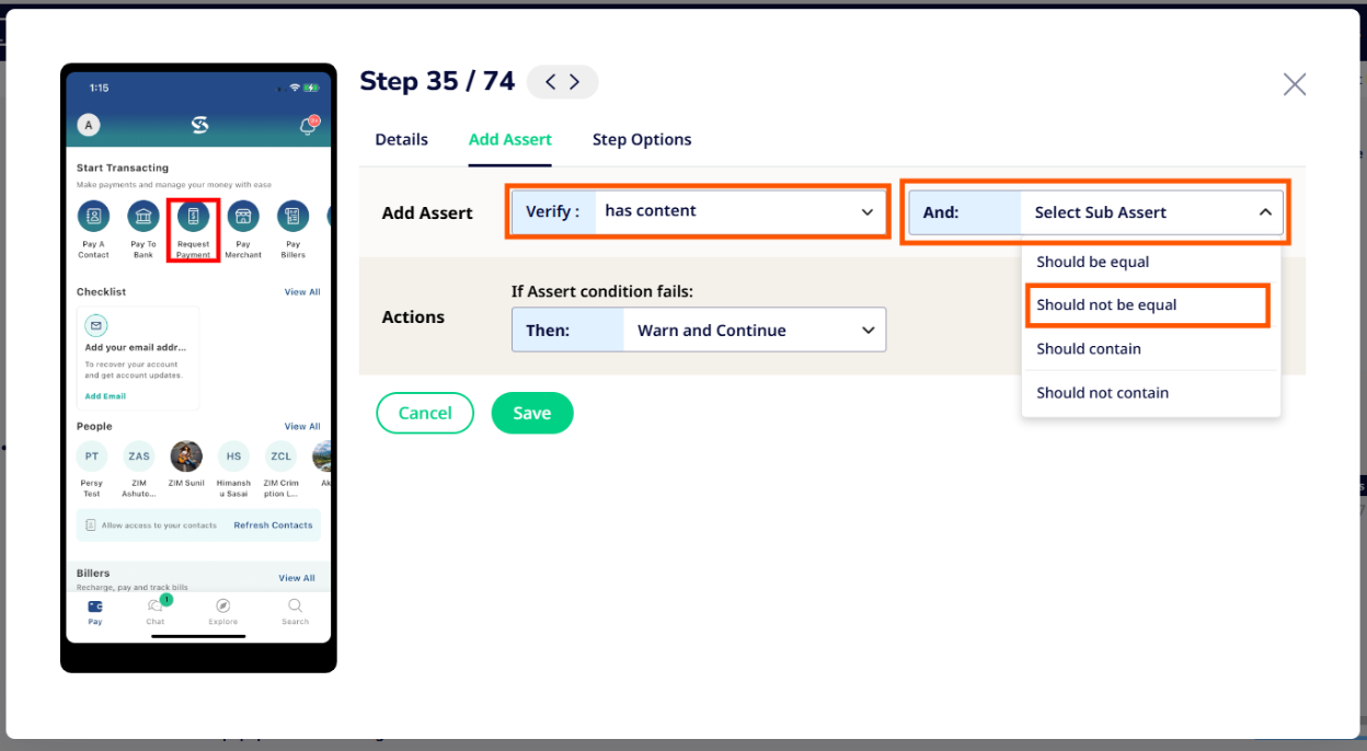
In this scenario, we have implemented assertions using the conditions "HAS CONTENT" and "SHOULD NOT BE EQUAL TO" a specific text value. After all the assertions have been applied and validated based on the defined scenario, we then proceed to perform the selected action, whether to fail the test on the basis of this assert or to keep executing with a warning.